Mobile devices are no longer an alternative way to browse the internet — they are the main way. Globally, more than half of all internet traffic now comes from mobile phones, and for many industries such as food delivery, retail, hospitality, and local services, the numbers are even higher.
This shift in user behavior has changed how websites need to be designed. A mobile first design approach focuses on creating the best possible experience on smaller screens before scaling up to desktops. This ensures clarity, speed, and usability, which directly translates to more conversions.
Whether your goal is more online sales, higher lead generation, or increased bookings, mobile first design can make the difference between losing a potential customer and gaining a loyal one.
Changing User Behavior
Mobile users have different browsing habits compared to desktop users. They expect fast results, easy navigation, and content that is simple to consume on the go.
Consider these real-world examples:
- A customer looking for a nearby restaurant is unlikely to wait for a slow-loading page.
- A shopper on an e-commerce site may abandon their cart if the checkout form is hard to fill on a small screen.
- A local service provider with an unresponsive website may lose leads to competitors who make it easier to click-to-call directly from search results.
This is why mobile first design is not just about fitting content onto a smaller screen. It is about understanding intent, reducing friction, and giving users exactly what they need when they need it.
How Mobile First Design Affects Conversions
When a website is built with mobile users in mind, the path to conversion becomes easier. Mobile first design directly impacts:
- Ease of Navigation: Clear menus, minimal clicks, and thumb-friendly layouts help users quickly reach the action they want.
- Speed: Mobile optimized websites load faster, reducing bounce rates. Even a one-second delay can significantly decrease conversions.
- Readability: Mobile first design uses scalable typography, white space, and clean layouts that improve readability on small screens.
- Trust: A professional, responsive website gives users confidence in your business, which increases the likelihood of purchase or inquiry.
Now compare this to a desktop first site that has been squeezed into mobile screens: tiny buttons, long load times, zooming in and out to read text. These frustrations directly reduce conversions.
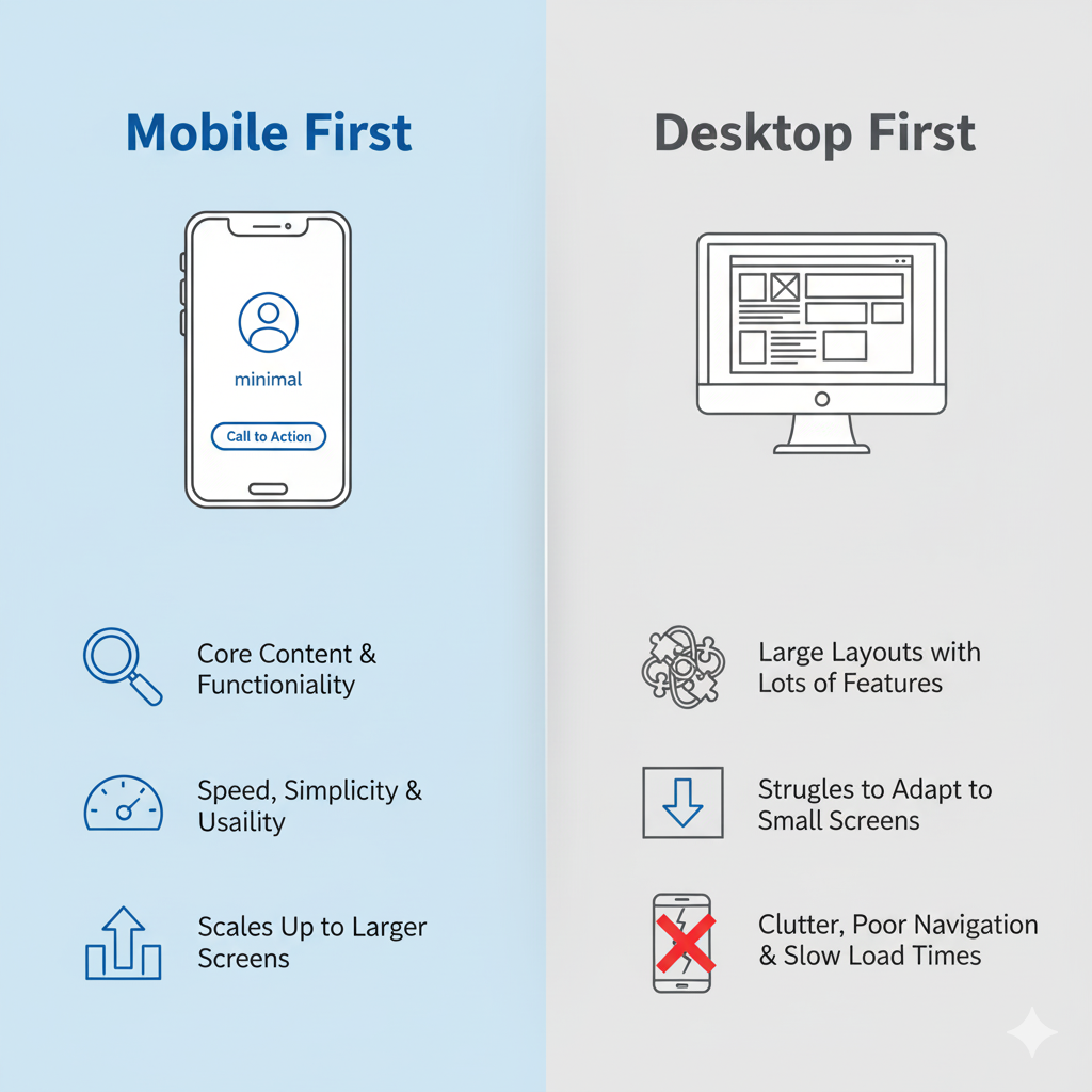
Mobile First vs Desktop First: A Strategic Comparison
Designing for mobile first and designing for desktop first are two very different approaches:
Mobile First
- Focuses on core content and functionality.
- Ensures speed, simplicity, and usability.
- Scales up to larger screens smoothly.
- Results in cleaner, more conversion-friendly design.
Desktop First
- Prioritizes large layouts with lots of features.
- Struggles to adapt to small screens.
- Often leads to clutter, poor navigation, and slow load times.
- Creates unnecessary friction that reduces conversions.
By starting with mobile first, you design for the most restricted environment. This forces prioritization of what matters most to users — exactly the kind of focus that increases conversions.
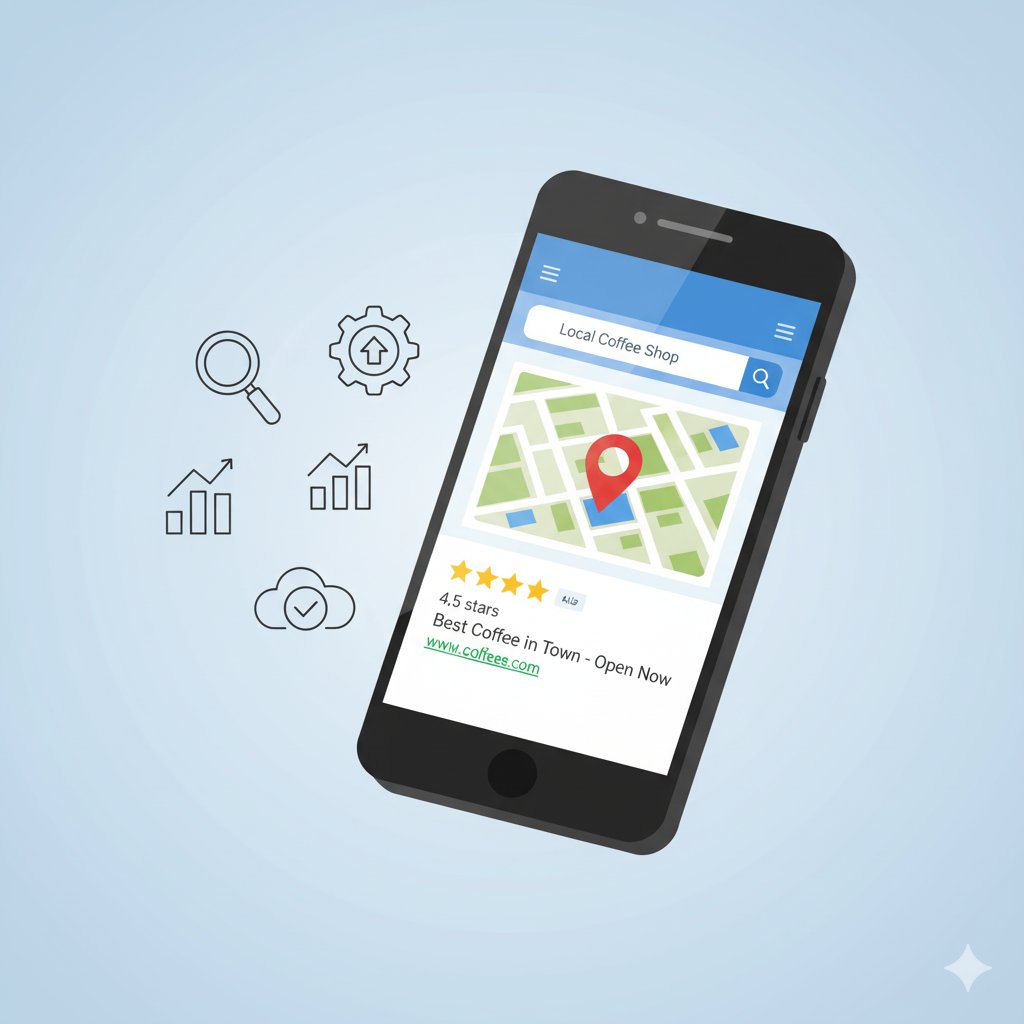
SEO and Mobile First Indexing
Google now primarily uses the mobile version of a site for indexing and ranking. This means if your website performs poorly on mobile devices, it will hurt your search visibility. A strong mobile first design not only improves user experience but also supports higher search rankings, which brings in more potential customers.
Real Business Benefits
Companies that adopt mobile first design often see measurable results:
- Lower bounce rates since users find what they want quickly.
- Higher checkout completion rates on e-commerce stores.
- Improved lead generation through simplified forms.
- Better local visibility in mobile searches.
- Stronger customer trust and brand perception.
These benefits are not limited to large corporations. Small businesses, restaurants, local shops, and service providers can all gain from mobile first strategies that make their sites more accessible to on-the-go customers.
Conclusion
Mobile first design is more than a design philosophy. It is a business strategy for conversions. By aligning with how people actually browse and shop today, you create experiences that are fast, clear, and trustworthy.
It boosts SEO, reduces friction, and ensures customers can take action without barriers. Whether you are building a new website or redesigning an old one, putting mobile first will maximize your ability to convert visitors into paying customers.


